Steps to View Graphs of Multiple sensors.
1. Select Sensors or Area Using the Selection Tool
Begin by using one of the Multi Selection Tools to highlight the specific sensors or geographic area (using the Polygon selection tool) you want to analyze. These tools allow for flexible selection based on location or instrument grouping.
2. Access the Graph Option
Once your selection is made:
- Navigate to the Option Bar
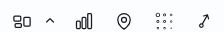
- Click on the Graph icon to visualize the data

3. View Grouped Sensors in the Instrument Graph Section
On the right side of the screen, you'll see the Instrument Graph section:
- Sensors are automatically grouped by Category
- This helps organize data for easier comparison and analysis
4. Select a Category to Display Sensor Data
Choose the relevant Category from the list:
- All sensors in the selection that belong to that category will be displayed in the graph, allowing you to view multiple data streams simultaneously.
5. Customize Sensor Selection
You can refine your graph by:
- Selecting additional sensors from the list to include more data
- Unselecting sensors to remove them from the graph view
This flexibility allows you to tailor the graph to your specific monitoring needs.
How to View Graph of a Single Sensor
Visualizing sensor data is essential for monitoring and analysis. This guide walks you through the steps to view the graph of a single sensor using the Maps interface.
1. Navigate to the Maps Page
Begin by accessing the Maps page within your monitoring dashboard. This is your central hub for visualizing spatial and sensor data.
2. Open the Layers Panel
Click on Layers to expand the available options. This panel allows you to control what data is displayed on the map.
3. Select the Monitoring Layer
From the Layers menu, choose Monitoring. This will show the instruments and sensors present in your project.
4. Choose Instrument Category and ID
Under the Instruments section:
- Select the appropriate Category (e.g., Tilt Meters, Strain Gauges, etc.)
- Then choose the specific Instrument ID for which you want to view the graph.
This filters the data to the selected instrument.
5. View and Switch Between Sensor Graphs
Once the graph window opens:
- You can select different Sensor IDs from the dropdown list to view their individual graphs. This is useful for comparing readings across multiple sensors within the same instrument.
6. Add Multiple Instruments to the Graph
Want to compare data across instruments?
- Simply add additional instruments to the graph window.
- Their data will be displayed simultaneously, allowing for multi-instrument analysis.
Frequently Asked Questions (FAQs)
Q1: Where can I find the graph option?
A: After making your selection, go to the Option Bar and click on the Graph icon to open the visualization window.
Q2: Can I view data from different categories together?
A: Yes, you can select multiple categories and view their sensor data simultaneously on the graph.
Q3: Can I switch between sensors within the same category?
A: Yes, once the graph window opens, you can use the dropdown or list to switch between different Sensor IDs.
Q4: Is it possible to compare multiple instruments on one graph?
A: Absolutely. You can add additional instruments to the graph window, and their data will be displayed together for multi-instrument analysis.